
You're paying for ads. You're posting on LinkedIn. Traffic is coming in. But the leads? Barely there.
Here's what most business owners don't want to hear: your website might be the problem. Research consistently shows that users form an opinion about a website within 50 milliseconds before they've read a single word. If your site is slow, confusing, or visually dated, visitors leave without ever becoming customers.
Business website problems are quietly killing conversions across every industry. This post breaks down exactly why that happens, what the most common culprits are, and more importantly what you can do about each one. Whether you're running a SaaS product, a consultancy, or a service business, these fixes apply directly to you.
1. Core Business Website Problems Hurting Conversions
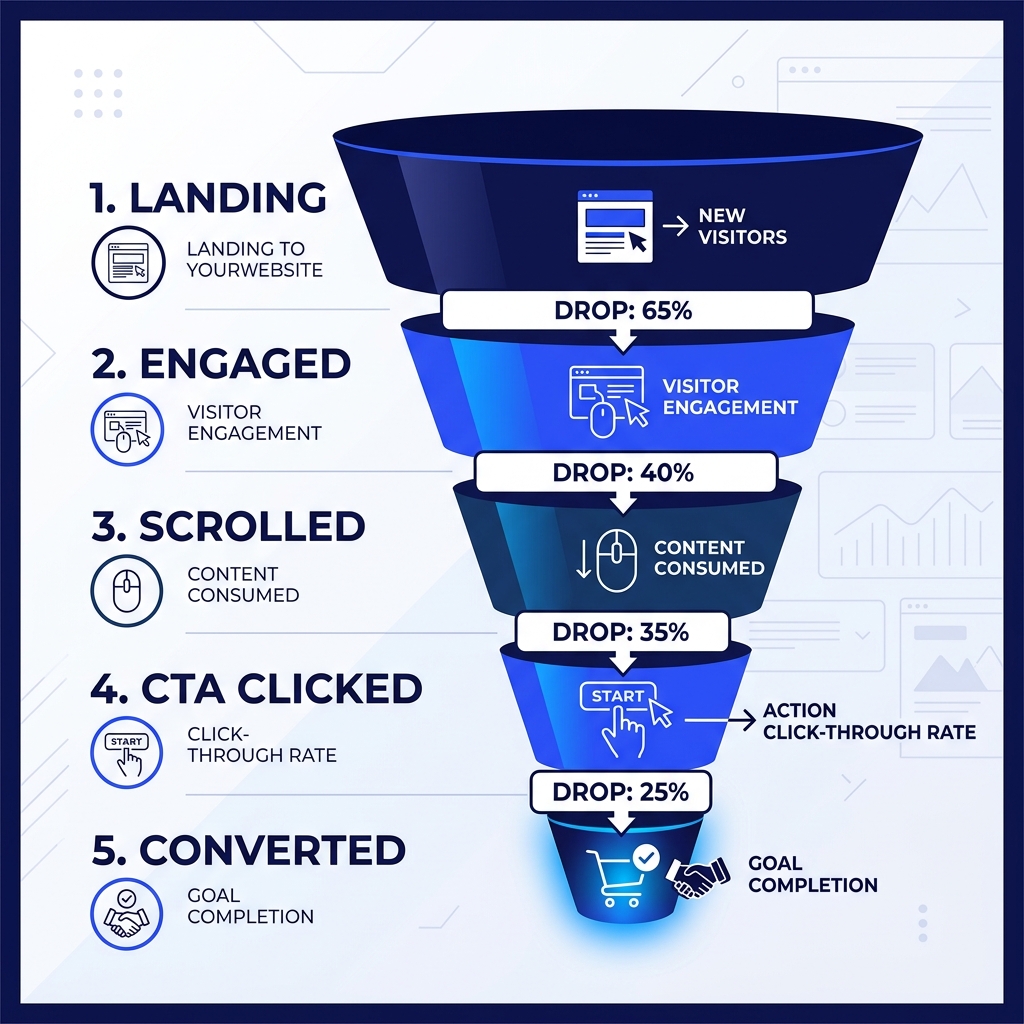
Most website problems don't feel like emergencies. They're slow bleeds a high bounce rate here, a drop-off in the contact form there. By the time you notice, you've already lost months of potential revenue.
Here are the core issues that cause the most damage:
Slow load times Google's own data shows that a 1-second delay in page load can reduce conversions by up to 20%. If your site takes more than 3 seconds to load on mobile, most visitors are already gone.
No clear value proposition When someone lands on your homepage, they should immediately understand: what you do, who it's for, and why they should care. If your headline says something vague like "Empowering businesses through innovation," you've already lost them.
Weak or missing calls to action (CTAs) A page without a clear CTA is just a pamphlet. Every key page home, services, about needs one action for the visitor to take. One. Not five.
Not mobile-optimised Over 60% of web traffic now comes from mobile. A site that's hard to navigate on a phone isn't just annoying it's a direct revenue leak.
No social proof Visitors from the US, UK, or Australia are conditioned to look for testimonials, case studies, and client logos before they trust you. Missing these is a significant conversion barrier, especially for high-ticket services.
Outdated design or copy A 2017-era website signals to a prospect that you may not be current in your field. Design communicates credibility before content ever gets the chance.
2. How to Fix Each Problem (Step by Step)
Let's move from diagnosis to action.
Fix Slow Load Times
- Run a speed audit first. Use PageSpeed Insights (free) or GTmetrix. Note your score on mobile, not just desktop.
- Compress all images. Use WebP format. A tool like Squoosh or the
next/imagecomponent in Next.js handles this automatically. - Enable lazy loading. Images below the fold should only load as the user scrolls.
- Review your hosting. Shared hosting on a budget plan is often the root cause. Moving to a VPS or a provider like Vercel, Render, or Railway can cut load times dramatically.
- Minimise third-party scripts. Analytics, chat widgets, and marketing pixels all add weight. Audit what's actually necessary.
Check our guide on How We Build High-Performance Web Apps for SaaS Startups to see how we optimize loading speeds and fix Core Web Vitals.
Fix Your Value Proposition
Follow this simple formula for your homepage headline:
[What you do] + [For whom] + [The outcome they get]
Example before: "Digital solutions for modern businesses." Example after: "Custom web apps and SaaS products for US and UK startups built to scale."
That's it. Specific beats clever every time.
Fix Your CTAs
| Weak CTA | Strong CTA |
|---|---|
| Learn More | See How We Cut Their Load Time by 60% |
| Contact Us | Book a Free 30-Min Discovery Call |
| Submit | Get My Custom Proposal |
| Click Here | Start Building My App |
Use one primary CTA per page. Make it contrast visually. Put it above the fold.
Fix Mobile Experience
- Use a responsive framework (Tailwind, Bootstrap, or any modern CSS grid)
- Test on real devices, not just browser dev tools
- Ensure tap targets (buttons, links) are at least 44×44px
- Avoid horizontal scroll at all costs
- Keep font sizes readable (minimum 16px body text)
3. Real-World Scenario: The SaaS Founder Who Couldn't Figure Out Why Sign-Ups Were Flat
Consider a B2B SaaS founder based in Austin. Their product solves a real pain point, they're getting 2,000 monthly visitors from content marketing, and their pricing is competitive. But free trial sign-ups are stuck under 1%.
When they do a proper website audit, here's what surfaces:
- The homepage hero takes 5.8 seconds to load on mobile (a large background video is the culprit)
- The headline reads "Streamline your operations" applicable to every SaaS ever made
- There are four CTAs on the homepage: "Try Free," "Watch Demo," "Read Docs," and "Contact Sales" none stands out
- There are no customer logos, testimonials, or case studies anywhere above the fold
- The pricing page buries the most important plan in the middle with no recommended highlight
None of these is catastrophic in isolation. Together, they create a pattern of low trust and friction at every stage of the funnel.
Fixing the load time alone (replacing the video with a static image and lazy-loading the rest) brought mobile load time under 2 seconds. Replacing the headline with "Run your field ops team without the spreadsheet chaos" and removing three of the four CTAs increased trial sign-ups by 34% within six weeks without a single extra dollar spent on ads.
This is the kind of work D Tech does routinely for clients across the US, UK, and Australia: diagnose what's actually broken, then fix it with precision rather than guesswork. Read our Case Study: How We Rebuilt a US Client's SaaS Dashboard and Doubled Their Trial Conversions to see how clean UX drives commercial success.
4. Common Mistakes to Avoid
Even well-intentioned website improvements go wrong. Watch out for these:
1. Redesigning when you should be testing A full redesign takes months and costs thousands. Before you rip everything up, A/B test your headline, your CTA placement, and your hero image. Data should drive design decisions, not aesthetics.
2. Optimising for desktop when your traffic is mobile Most audits get run on a desktop browser. Pull up your Google Analytics or Plausible data if 60%+ of your visitors are on mobile, that's where you optimise first.
3. Adding features instead of removing friction A chatbot, a cookie consent popup, a newsletter modal, and an exit-intent popup all firing at once is not a user experience it's an obstacle course. Less, consistently, outperforms more.
4. Ignoring page-level analytics Your homepage might be fine. Your /services page might have an 85% bounce rate. Use tools like Microsoft Clarity (free) or Hotjar to see exactly where users drop off and why.
5. Treating copy as an afterthought Developers and designers often treat website copy as placeholder text that marketing will "fill in later." It never gets done properly. Your copy is doing the selling. Invest in it accordingly.
Conclusion
If your website isn't converting, it's rarely one big problem it's a cluster of small ones that compound. Slow load times erode trust before you've even said hello. Vague copy fails to answer the visitor's most basic question: why you? Weak CTAs remove the path to action.
The good news is that each of these is fixable. Often quickly, and without a full redesign.
Start with a speed audit, clarify your value proposition, and cut your CTAs down to one per page. Those three changes alone move the needle for most sites.
If you need a full website overhaul, a custom web app, or a SaaS product built from scratch, D Tech offers end-to-end development tailored for high-growth businesses. Learn What to Expect From a Discovery Call With D Tech and book a free discovery call or explore our services at dtechsolutions.tech.